Dumfries Wedding Disco Hire. Why use a Professional DJ Service.

Jingles Dumfries Wedding Disco has taken the time to answer some FAQ and reasons why you should choose a professional DJ. So you’ve decided on a Wedding Disco Before you book and during the booking process you can tell a lot about a DJ business. How did they respond to your initial email/phone call? How long did they take to reply? Do they have the correct licenses and insurance to DJ your Wedding? Don’t be afraid to ask your DJ these questions before you book.

If they are a professional disco they will be able to answer yes to all of your questions. Your Wedding DJ should give you the option to submit a playlist in advance of your Wedding to allow you to choose some of the music that is played on the night.

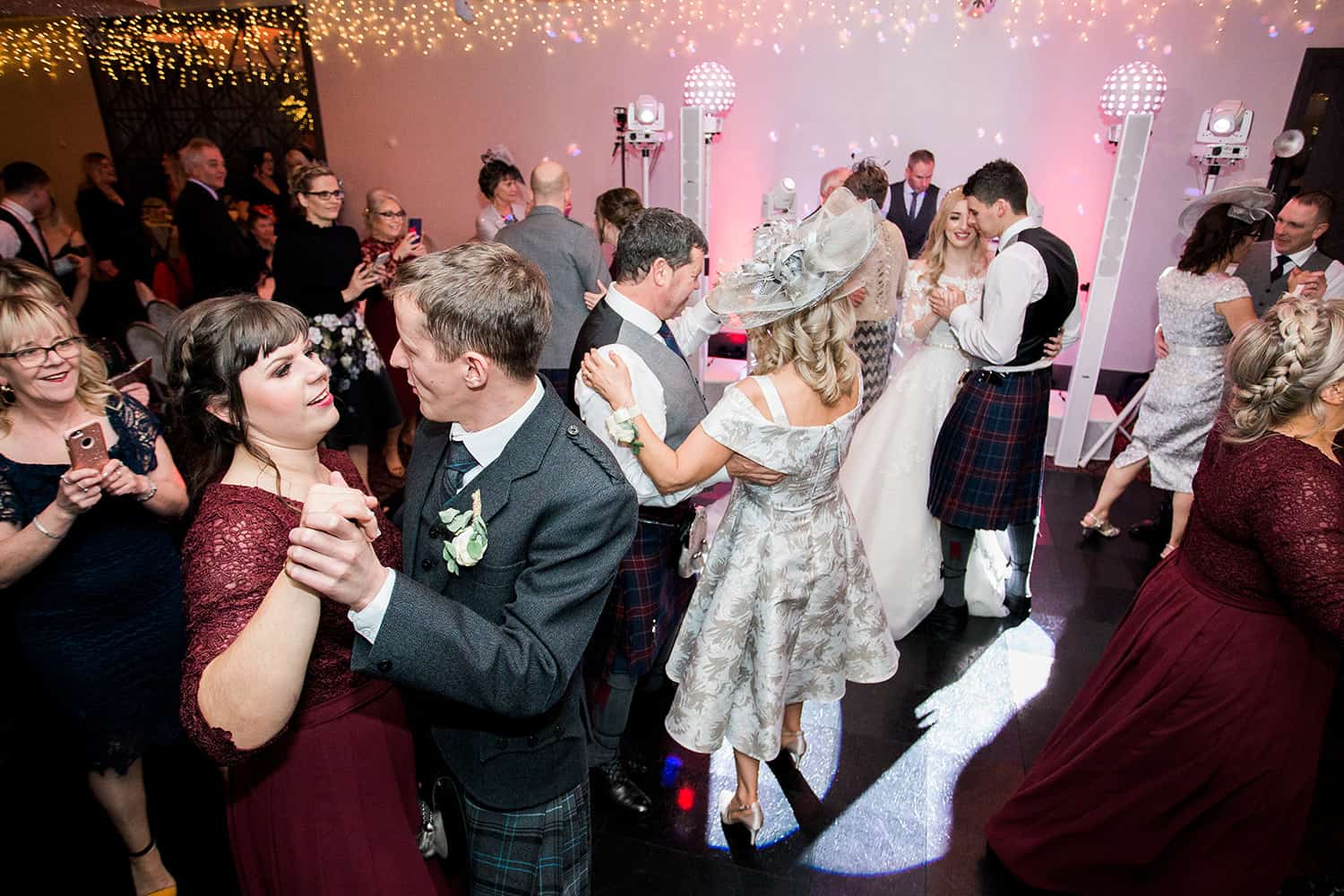
  • Choose the correct disco and the DJ will have the experience to work out what type of music will get everyone on the dance floor. Not everyone likes the same type of music. After all, the type of music that your younger guests may like will possibly not suit your parents or grand parents! It is important that the DJ has a large enough collection of music to suit all ages.
  • A professional Wedding DJ will also have tried and tested ways to encourage your guests onto the dance floor if at any point there is a lull in the dancing.
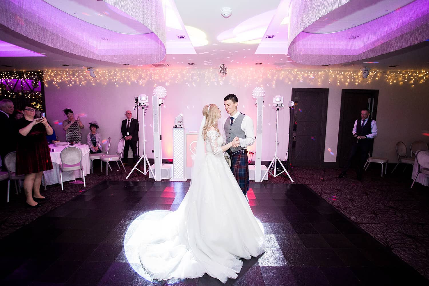
  • The wedding disco hire you choose to go with has to look and sound good. It also has to be set up on time. The last thing you want is someone turning up (late) with scruffy equipment and have cables lying about everywhere. It doesn’t make for a good look on your wedding photographs and won’t help with the atmosphere at your wedding.
Here are a few things you should ask your DJ or you should find out before booking them.

  • Do they have public liability insurance?
  • Has all of their equipment been PAT tested (electrically tested for safety)
  • Do they have an up to date website, and does the website have details where you are able to contact them in the event that you have any concerns?
  • Have you checked their Facebook page? Are there current photos of weddings they have been booked for? Do they have good reviews on Facebook?
  • When booking your DJ do they offer a contract for your piece of mind.
  • Is your DJ happy to accept a playlist of music you and your guests would like to hear and will they put cards on the tables to allow for requests on the night of your wedding?
  • Are they happy to meet with you before you have booked and also just before your wedding (very important, to allow you to discuss your music requirements and the format of the evening)?
  • On the evening of your wedding is the DJ happy to make announcements e.g. cutting the cake, announcing the bride and groom and wedding party onto the dancefloor etc etc.
  • Will your DJ be able to ‘read the crowd’ and adapt the music accordingly?
  • Will your DJ be dressed for the occasion?

And finally, and also very important, will your wedding disco look tidy and “look the part” at your wedding/in your wedding photographs?

At Jingles Professional Wedding Disco we are proud to say that we have provided disco entertainment for hundreds of weddings over the years, so know a thing or two about what makes a great wedding celebration. We are recommended by many local hotels and wedding venues. We have a unique disco unit that looks (and sounds) amazing. It won’t spoil your first dance photos! And last but not least we are part of Dumfries and Galloway’s Trusted Trader Scheme and are approved by trading standards.

You can find Mikes’ details below ;

Contact Details
Mike Wells
www.jinglesdisco.com   
www.facebook.com/jinglesdisco

Share this story

COMMENTS Expand -
  1. MiaMn says:
    Your comment is awaiting moderation. This is a preview; your comment will be visible after it has been approved.
    My swimming routine is making me reconsider my fringe. I usually head straight to work after a shower, so a reference photo with a carefully styled fringe tells me only part of the story. I have little time to reshape the front sections. A soft curtain fringe is on my shortlist. I found a starting point while looking at curtain bang lengths and hope to put the examples into a realistic routine. Would air drying make the front sections difficult to arrange? I plan to include an unstyled photo in the consultation. That should give the stylist a clearer picture of my routine. My main concern is whether the shorter pieces will keep falling forward during the day. I would rather understand that before choosing a length that depends on equipment I cannot carry to work. What helped other swimmers decide how short to take the front?
  2. ChloePror says:
    Your comment is awaiting moderation. This is a preview; your comment will be visible after it has been approved.
    Two gray streaks have become part of my appearance, and I am not looking to cover them completely. The question is what happens visually if the rest of my hair becomes slightly darker. Most edited examples I have seen recolor everything together, which removes the feature I want to compare. I found a reference for hair color try on but I would like advice on representing mixed gray and colored sections in a useful comparison. Would you draw the sections on a photo rather than aim for a realistic edited result? I could mark which areas should remain untouched and compare only two possible depths around them. The picture would only help explain the idea, rather than predict the result of a color service. If you have kept deliberate gray streaks, what visual references helped you explain the balance you wanted?
  3. EllaTout says:
    Your comment is awaiting moderation. This is a preview; your comment will be visible after it has been approved.
    I am preparing a portrait comparison for an online group discussion about possible hair color changes. I want the comparison to be easy to read without turning it into a vote on the best-looking picture. Every version will use the same framing, since different crops could distract people from the actual color change. While looking into a hair color simulator I started making a checklist of the settings that should stay consistent. I plan to keep the original background and avoid making one version brighter just to improve its appearance. Numbering the alternatives might encourage more specific observations than presenting them with attractive color names from the start. I will explain that the images are discussion aids and cannot show exactly how real coloring would turn out. The second part could show the names and check whether they change how people describe the same options. Which other presentation details might distort this kind of side-by-side hair color comparison?
  4. Hannahmr says:
    Your comment is awaiting moderation. This is a preview; your comment will be visible after it has been approved.
    Our small theatre group needs a wig for a character who appears under both warm and cool lights. The costume is already finished. Now the hair shade is the part we cannot agree on. The camera makes our brown sample look nearly black. The copper option also shifts between pictures. I was looking at hair color simulator as a way to sketch a few alternatives before we order actual samples. I would keep the same portrait for each comparison. The lighting would stay unchanged too. However, a screen preview cannot tell us how a wig will reflect the stage lights. How would you organize a fair comparison? We can test during the next rehearsal. Three distinct options would be easier to assess than a large gallery. The aim is to keep the character recognizable across scenes without choosing solely from a heavily edited photograph.
  5. NoraMr says:
    Your comment is awaiting moderation. This is a preview; your comment will be visible after it has been approved.
    I tried comparing a few fabric colors against my face, but the photos from my phone are not consistent. Under the kitchen light my skin looks much warmer than it does in daylight. I am struggling to judge whether a cream or a clear white fabric is actually more flattering. I looked up some advice on skin tone analysis and would like to use a fair setup before drawing conclusions. I could turn off the room lights and take both photos in the same spot, at the same time, with the same camera settings. Would you avoid automatic color adjustments entirely, or would that make the comparison more complicated than it needs to be? I am curious if a plain background matters as much as the light falling on the face. I would rather observe a visible change than trust a label. If you have tested undertones at home, what would you control first, and what signs would make you retake the pictures?
  6. Chloerero says:
    Your comment is awaiting moderation. This is a preview; your comment will be visible after it has been approved.
    Our portrait form needs a basic consistency check before we discuss its face shape categories. The first question is whether changing the crop alters the label without changing the face itself. My starting set would contain one portrait used with permission and a note of its original size. The copies would change only the surrounding space, leaving the face at its original proportions. I am considering face shape detector as a reference while drafting the questions. The plan is still on paper, with no measured outcomes or confirmed behavior behind it. I would log the image variation, the label and whether the result expresses uncertainty. Would you compare only the final categories, or also record where the outline was detected? My priority is a clear account of changed outputs, with room for genuinely uncertain classifications.
  7. Chloemony says:
    Your comment is awaiting moderation. This is a preview; your comment will be visible after it has been approved.
    I am preparing facial outline studies for a drawing class and need some clear labels. I can draw the outline, but explaining why I called it oval rather than oblong is harder. My aim is to record the proportions I see, without treating any outline as the ideal. I have oval face shape on my reading list for the terminology. Would you mark the widest area first, then compare the overall length with the width? There is room for a few guide marks, though I do not want them to overwhelm the sketch. The jaw and forehead also need separate notes so that the label does not hide their differences. An example of useful annotation would help more than a list of celebrities with similar faces. The assignment asks for a reasoned description, so simply writing a category name will not be enough. How would you explain a borderline example to someone learning to observe proportions?
  8. GraceMn says:
    Your comment is awaiting moderation. This is a preview; your comment will be visible after it has been approved.
    Our digital literacy workshop will discuss how websites classify face outlines. The goal is to ask better questions about classifications without ranking anyone’s appearance. One possible starting point for the reading list is what is my face shape as an example of the terminology involved. Its output would still need separate evaluation. The first activity would ask participants what outline features a classification might consider. We could then identify what the photograph does not show clearly enough to judge. The activity could use descriptions alone, so sharing a personal photograph would remain unnecessary. Each group could explain which evidence would change its initial interpretation. We could also compare two written descriptions of the same outline and ask whether their labels mean the same thing. This would make the assumptions available for discussion without requiring a supposedly correct personal result. What questions would make this a useful lesson in evaluating claims rather than another appearance quiz?
  9. NoraLaf says:
    Your comment is awaiting moderation. This is a preview; your comment will be visible after it has been approved.
    For a drawing exercise, I want to describe the outline of a head before working on the smaller facial features. An angular jaw stands out in my reference, but I am unsure how much weight it deserves in the complete outline. I have been looking for a reference on square face shape to help frame the discussion. My aim is to write down the proportions I can actually see, then decide whether a category helps explain them. Could I begin with separate marks for the forehead, cheekbones and jaw, and compare those widths before drawing the contour? Hair covers part of the outline in several references, so I also need a way to mark what remains uncertain. We could use one simple worksheet to keep our observations comparable before moving on to the actual pencil studies. It would help if the exercise allowed mixed features, because a tidy label can distract us from what is actually visible. Which observations would you put on the worksheet to keep the discussion practical and grounded in the actual reference picture?
  10. Georgeoi says:
    Your comment is awaiting moderation. This is a preview; your comment will be visible after it has been approved.
    I am preparing to sew my first tailored jacket. The fabric is expensive enough that I want to choose carefully. The supplier offers small swatches, although each piece is much smaller than a collar or lapel. I am considering moss green, plum, and a medium grey. Each option fits reasonably well with my existing wardrobe. I have enough time to order samples before the sewing class starts. My main concern is that texture and the amount of visible fabric could change my impression once the jacket is actually assembled. I have read about how to find my color palette but I still need a practical way to judge these particular fabrics. Can such small samples reveal much about a color near the face? I could place them over a larger neutral cloth. I would also compare them with the lining and buttons. Which comparisons would you make before ordering the full length?
  11. Jackdync says:
    Your comment is awaiting moderation. This is a preview; your comment will be visible after it has been approved.
    A generated background loop sounds comfortable under narration, but a faint metallic texture appears whenever the speaker pauses. Because the voice carries the episode, I want to assess the music at its intended level rather than in isolation. I can shorten the loop or choose another passage, although either choice changes the pacing around the introduction. I came across remove ai artifacts from audio while looking for ways to frame the decision. I have not processed this passage yet and would like a sensible comparison procedure before changing the file. Would you compare the original and a repaired copy beneath the same stretch of narration? I would keep the music level fixed and include a pause long enough to expose the texture. Listening to the music alone could then reveal whether processing affected percussion or stereo width. Which listening cue would persuade you that this background loop needs further work?
  12. Ethanmi says:
    Your comment is awaiting moderation. This is a preview; your comment will be visible after it has been approved.
    We’re comparing apartments for a short family trip to Tenerife and keep coming back to Playa de las Americas. The area looks convenient, but listings that appear similar can be very different once I look at their exact location. I started with are there any holiday rentals available in playa de las americas, canary islands, spain? and found plenty of results, so availability alone doesn’t help us choose. Our main priorities are an easy walk for meals, a practical route to the beach, and a place where evenings aren’t dominated by noise. It’s hard to tell from the photos the route from the building to the promenade or whether the bedroom faces a busy street. I plan to check recent guest comments, the exact map pin, and whether the stated sleeping arrangements really work for our group. Would you ask the host about street-facing rooms and late-evening noise before paying, or is there another detail visitors often miss? We won’t have a car every day so a manageable uphill return matters more to us than a slightly better view. I’d welcome advice about which nearby streets feel calmer while still being convenient for a family arriving after a flight. If you know the area well, what checks helped you avoid a poor fit, and which listing details turned out to matter most in practice?
  13. NoahCoax says:
    Your comment is awaiting moderation. This is a preview; your comment will be visible after it has been approved.
    I am preparing notes for a remote editor who will receive our demo. There is a texture I want them to assess, but describing it as strange or metallic feels too vague to be useful. I would rather send a precise observation than prescribe a fix. I would begin with the exact filename and revision date. The passage can be described with a start and end timestamp. I came across suno shimmer as a possible term while reading about generated audio, although I am not sure it fits this particular sound. The note should separate observation from interpretation. The headphones or speakers used could be recorded in the note. The original file would accompany the marked excerpt. Specific processing choices can wait until the editor has listened. What else belongs in a concise report like this?
  14. EllaMag says:
    Your comment is awaiting moderation. This is a preview; your comment will be visible after it has been approved.
    I am choosing where to stay in southern Tenerife for a summer break, and the descriptions of the resort areas are starting to blur together. My priority is somewhere I can walk to the sea in the morning and still find a calm place to eat in the evening. Busy nightlife is not part of the plan, but I also do not want to depend on a car for every meal or short walk. I started comparing beaches in tenerife south and now I am trying to separate the beach itself from the feel of the streets around it. Some places seem convenient on a map, yet reviews suggest that a short distance can still involve steep roads or traffic. I would rather find an easy place to return to than spend each day travelling across the island to find a quieter stretch of sand. Is there an area you would recommend for a solo traveller who likes swimming, coastal walks, and early evenings? I can take a bus or taxi for occasional excursions, so perfect access to every attraction is not necessary. Observations about the atmosphere after dark would be welcome, especially from someone who has stayed nearby. I would love to hear what daily life there actually feels like.
  15. GeorgeEr says:
    Your comment is awaiting moderation. This is a preview; your comment will be visible after it has been approved.
    I am looking for a first levada walk in Madeira, but route length alone does not tell me whether it will be comfortable. I am fine with a steady half-day hike, yet narrow paths beside steep drops are a different matter for me. Some descriptions mention tunnels, and I am not sure how much light or headroom to expect. To make a shortlist I checked best levada walks in madeira but I would rather choose by conditions than by a ranking. After a wet evening, I assume a route can feel quite different from its photos. How do you verify a trail is suitable on the day and decide whether to postpone instead of pressing on? Transport matters as well, because I will not have a car and would prefer not to rely on an uncertain pickup. I would appreciate a beginner-friendly route idea, plus any warning signs that would make you choose a different day or trail. Even a familiar trail could be unsuitable in poor weather.
  16. Lucysl says:
    Your comment is awaiting moderation. This is a preview; your comment will be visible after it has been approved.
    Would a simple comparison station help visitors see how scarf colors affect a portrait? At an upcoming library portrait session, we hope to offer visitors a few scarves to try. My aim is a friendly comparison rather than a verdict about which colors someone is allowed to wear. One idea is to compare softer and brighter scarves against the same background without changing the camera setup. The difficult part is describing what changes without telling a visitor that their preferred scarf looks wrong. Could we start by asking where the eye goes in each photograph, leaving seasonal names until later? A topic I would like to understand better is personal color analysis though practical experience with a community activity would be more useful than another rigid list of rules. Which questions would you put on a short feedback card, and which claims would you avoid making altogether?
  17. LiamTOF says:
    Your comment is awaiting moderation. This is a preview; your comment will be visible after it has been approved.
    Our team is updating the staff portraits, and I have been asked to choose two background colors before the photographer arrives. We have time to test this properly before the booking is finalized. Our existing blue backdrop seems to emphasize shadows on several people in the proofs. I would prefer a small printed comparison before committing to the final background materials. People are bringing their usual work clothes, which makes a shared clothing palette impractical. A useful starting topic for me is personal color analysis but I am unsure how much that helps when choosing a background for a group. Would neutral reference cards help us compare the proofs without arguing over monitor settings? A brief test with consistent lighting and exposure is possible before the main session. Has anyone used a practical comparison process that works across several different complexions?
  18. EmilyNen says:
    Your comment is awaiting moderation. This is a preview; your comment will be visible after it has been approved.
    My current animation is a brief loop built around small movements rather than dialogue. The generated music idea fits the mood, but a persistent bright texture keeps drawing my attention away from the movement. I am trying to decide whether to revise the sound, choose another sketch, or leave more silence between events. I found the term suno shimmer but that wording does not establish what causes the texture in this recording. Do you start by listening against the picture, or listen separately and then check the visual timing? I want the little movements to remain readable without making the whole soundtrack feel empty. The loop will play on a small screen as well as headphones, so I can check both contexts. I would keep the comparison volume consistent and use the same section of animation. How do you compare several options without becoming too accustomed to the distracting texture?
  19. MiaWed says:
    Your comment is awaiting moderation. This is a preview; your comment will be visible after it has been approved.
    What information belongs in a handoff note for a generated podcast theme? We are planning a shared folder where the original export stays easy to identify. The aim is to let the next editor understand what changed without guessing from the filename. I came across suno fix while collecting references for the discussion. My proposed note includes the source format, export settings, and the section under discussion. Would you keep a separate change log beside the audio files? An approval note should identify the reviewed version rather than apply vaguely to the whole folder. The original will stay in the folder while we decide whether a revision is useful. A dated note about who prepared each file would also help us resolve questions during the final approval stage. I would appreciate examples of concise handoff notes that have worked for other small teams.
  20. HannahFuh says:
    Your comment is awaiting moderation. This is a preview; your comment will be visible after it has been approved.
    Our radio workshop is putting together a brief music programme. A generated track ends with a dense texture just before the next spoken part. I want to check the programme layout before making changes to the song itself. A short pause might be enough, although it changes the pace of the segment. Another possibility is to move the speech later and retain the complete ending. One related term I have encountered is suno shimmer in this context. That does not replace listening to this passage at a stable playback level. Would you try a brief gap or a restrained fade when speech follows a dense ending? We can record two versions of the transition and listen away from the editing screen, using the same playback level so that the louder option does not automatically seem clearer. I want the presenter to remain intelligible while the musical ending keeps its character.
  21. LucasDale says:
    Your comment is awaiting moderation. This is a preview; your comment will be visible after it has been approved.
    I need an ambient cue to repeat while a player explores a small room. The seam becomes distracting when I listen through several consecutive cycles. I am unsure whether the problem is the edit or a texture near the ending. I would first compare a longer crossfade with the current short transition. Each version would use the same level and the same unaltered middle section. There is no dramatic change in the room at the repeat point, so the music should not imply one. I would listen to several cycles in context, then inspect the boundary separately, keeping notes about exactly when the interruption becomes apparent. A page about remove suno artifacts came up during my search for another possible check. Without a comparison, I cannot tell whether processing would affect the boundary usefully. The priority is an unobtrusive repeat that preserves the mood of the room. What diagnostic order would help separate editing choices from source texture?
  22. Jackpn says:
    Your comment is awaiting moderation. This is a preview; your comment will be visible after it has been approved.
    I am working on a character sheet and want to compare three possible hair colors without redesigning the face or outfit. The outfit is mostly blue, the background is quiet, and the final drawings will often be viewed as fairly small images. My first options are dark brown, light copper, and silver, chosen because they create noticeably different relationships with the existing colors. My search for ways to explain warm and cool color choices brought me to a personal color test as a starting point for further reading. I realize personal palette systems concern real people, so I would use that material as a discussion prompt rather than an artistic rule. I need a way to discuss visual emphasis, since a hair color that looks interesting close up may dominate the smaller image. Would you review the versions side by side first, or check their light and dark values before asking classmates for opinions? Please suggest concrete things to look for, so our feedback describes what each version does within this particular composition.
  23. Ellabep says:
    Your comment is awaiting moderation. This is a preview; your comment will be visible after it has been approved.
    I enjoyed my previous short cut until I had to style it myself on a busy weekday. For the next appointment, I want to compare bob lengths with the time I actually have to get ready. The ends tend to turn outward at jaw level, and I want the reference pictures to account for that. I saved a page while searching for blonde bob and would use it as a starting point for comparing outlines. I would keep the colour unchanged and focus on where the ends sit, rather than changing several things together. Alongside the front picture, I would collect side and back views so the discussion covers more than my face. I want the consultation to cover what happens on a normal day when I skip the brush and dryer. I would rather choose a slightly longer version than discover that the shorter one needs constant attention every morning. What would you ask at the consultation to distinguish a manageable bob from one that depends on daily styling?
  24. MartaRop says:
    Your comment is awaiting moderation. This is a preview; your comment will be visible after it has been approved.
    A warm candlelight touched that smooth form as she stretched open open softly over silken smooth bedding sheets, the warm orbs focused upon him through one lingering, tender grin.The traced slender soft pad on soft contour across her collarbone, after down, teasing delicate sheer edge on fine delicate fabric till thin single band eased away bare body.A light murmur escaped parted soft form as she pictured one warm touch supplanting same role, feeling every soft alongside warm region.Curving full shape, the showed rounded generous form across her form, tight points reacting from the intensity from steady attention simply!Gradually woman parted the form, uncovering the desire still now pulsed from anticipation to gentle touch.Her light hands slid within them, tracing deliberate, playful loops while she sighed that sound like quiet tender promise.“Come closer,” woman said, the words deep of yearning — presently second each part within me is toward you.” How Adult Game Developers Actually Handle Negative Community Backlash
  25. Ellatot says:
    Your comment is awaiting moderation. This is a preview; your comment will be visible after it has been approved.
    I have one uncommitted day during a stay in Funchal and am wondering whether a day trip to Porto Santo would feel worthwhile without turning into a transport exercise. I have not booked the ferry yet, so I can compare the current timetable with the forecast before deciding. I am trying to judge the usable hours ashore, once the journey to the port and boarding time are included. I would be content with a beach stroll and a meal, rather than attempting a full sightseeing circuit in a few hours. I would verify the sailings directly before making a reservation, and I would also look at any weather or service notice close to the date. One page I have been checking for local context is madeira island news though an article cannot replace a live ferry notice. Would you book only when the forecast is clearer? I can spend the day on Madeira instead if the crossing looks uncertain or the time ashore is too short. I am particularly interested in the return trip, including how easily someone without a car can get back to central Funchal. I would welcome a recent example of how the day worked in practice.
  26. FelixDrek says:
    Your comment is awaiting moderation. This is a preview; your comment will be visible after it has been approved.
    Bei der Planung unserer Reise nach Fuerteventura fragen wir uns, was sich auch an windigen Tagen gut unternehmen lasst. Wir reisen zu zweit und konnen einzelne Tage spontan planen. Ein Mietwagen ist wahrscheinlich vorhanden, trotzdem mochten wir nicht fur jeden Ausflug stundenlang fahren. Bei der Wahl der Unterkunft mochten wir auch kurze Wege zu kleinen Ausflugen berucksichtigen. Wir mogen ruhige Spaziergange und Orte, an denen man auch ohne gro?en Zeitdruck bleiben kann. Bei der Suche nach aktivitaten auf fuerteventura sind viele lange Listen aufgetaucht. Fur uns ware hilfreicher zu wissen, welche Ziele bei Wind noch angenehm sind und welche man besser an einem ruhigeren Tag besucht. Gibt es einen Ausflug, den ihr gerade bei starkerem Wind empfehlen wurdet? Wir wollen keine riskanten Kustenwege einplanen und wurden bei schlechter Sicht oder starkem Wind lieber umkehren. Auch ein Dorfbesuch mit einem Spaziergang ware vollig in Ordnung. An sehr windigen Tagen wurden wir offene Kustenabschnitte meiden. Wir wurden die Tagesplanung gern erst nach einem Blick auf das Wetter festlegen. Falls ihr im Herbst dort wart: Welche Unternehmung hat euch gefallen, obwohl der Strand fur einen langen Aufenthalt zu windig war? Uns helfen besonders Angaben dazu, wie lange ihr tatsachlich unterwegs wart. Ein flexibler Tagesplan ist uns bei diesem Wetter besonders wichtig. Auch weniger bekannte Orte sind willkommen, solange sie gut erreichbar sind.
  27. РусланKade says:
    Your comment is awaiting moderation. This is a preview; your comment will be visible after it has been approved.
    Выбираем место для семейного отпуска, в котором пляж будет удобен маленькому ребёнку. Красивые фотографии помогают составить список, но по ним сложно понять, как проходит обычный день у воды. В первую очередь смотрим на удобный заход в воду. Нужна возможность делать перерывы в тени рядом с пляжем. Не хотим каждый раз собирать все вещи и долго идти обратно к жилью, когда ребёнок устанет. Бытовые вопросы вроде туалета и питьевой воды тоже включили в список. Для первоначального поиска смотрим материалы по теме канарские острова и затем оцениваем несколько пляжей по одному простому списку. Машину пока не планируем брать на весь отпуск. Поэтому длинный путь от остановки или крутой спуск могут оказаться важнее живописного вида. Ещё хочется понять, будет ли удобно идти к пляжу с коляской и сумкой для детских вещей. Какие детали стоит проверить до бронирования жилья? Особенно помогут примеры, где понятны путь к берегу и условия вокруг него.
  28. Laurahelt says:
    Your comment is awaiting moderation. This is a preview; your comment will be visible after it has been approved.
    Wahrend einer Stadtereise nach Barcelona bleibt uns ein ganzer Tag fur Meer und Strand. Wir wohnen im Zentrum und sind ohne Auto unterwegs. Lange Umstiege passen nicht zu einem entspannten Badetag. Fur den Strand nehmen wir uns bewusst einen gro?eren Teil des Tages. Ein etwas ruhigerer Abschnitt ware uns lieber als die vollste Promenade. Eine verlassliche Verbindung zuruck ins Zentrum bleibt wichtig. Wir nehmen nur leichtes Gepack und keine gro?en Strandmobel mit. Ein paar Minuten zu Fu? nach der Fahrt storen uns nicht. Lange Wege in der Mittagshitze wurden wir vermeiden. Als Suchbegriff habe ich barcelona beste strande notiert. Welche Abschnitte wurdet ihr fur diesen Tagesplan vergleichen? Besonders hilfreich waren Erfahrungen zur tatsachlichen Fahrzeit, zur Orientierung vor Ort und zur Ruckfahrt am Abend. Auch Hinweise zu Schatten und einfachen Pausenmoglichkeiten wurden uns bei der Wahl helfen. Wir mochten die Entscheidung vorher treffen, damit wir den Tag nicht mit mehreren spontanen Ortswechseln verbringen.
  29. Аннаoa says:
    Your comment is awaiting moderation. This is a preview; your comment will be visible after it has been approved.
    Готовлю короткую поездку в Мадрид, которая начинается с позднего прилёта. Бронирование пока не сделал: сначала сравниваю районы с удобным проездом. Багажа немного, однако поздним вечером длинные переходы кажутся неудобными. Сравниваю метро, электричку и автобус, не пытаясь заранее объявить один вариант лучшим. Отдельно хочу заложить запас на выход из самолёта и поиск нужной остановки. Также хочется понять порядок покупки билета, чтобы не задерживаться у кассы. При задержке рейса хотелось бы иметь другой маршрут, который действительно доступен вечером. Буду благодарен за советы с указанием терминала и примерного времени поездки. как добраться из аэропорта мадрида в центр — такой материал использую как отправную точку. Расписания и условия проезда хочу проверить перед вылетом; сейчас важнее понять, какие детали стоит уточнить для своего рейса. Также интересно, насколько легко ориентироваться по указателям после прилёта и стоит ли заранее сохранить схему переходов на телефон, чтобы пользоваться ею без интернета.
  30. Дарьяpt says:
    Your comment is awaiting moderation. This is a preview; your comment will be visible after it has been approved.
    На поездку в Потсдам у меня есть один свободный день, и хочется заранее прикинуть, какую часть его займёт прогулка. Ранний подъём хотелось бы исключить, но возвращение тоже ограничено: на вечер уже есть другие планы. Мне нужен спокойный порядок действий: добраться, погулять и вернуться, оставив небольшой запас на непредвиденные задержки. Пока разбирался с транспортом, сохранил страницу по теме потсдам сан-суси как добраться — это отправная точка для дальнейших уточнений. С собой планирую взять воду и небольшой перекус, но остановку на обед тоже хотелось бы предусмотреть. Для меня это первая поездка в Потсдам, поэтому расстояния по карте пока трудно соотнести с реальной прогулкой. Остался вопрос к тем, кто уже был: где лучше начать прогулку, чтобы не делать лишних кругов? Особенно интересует, стоит ли сначала идти в парк или оставить его после короткой прогулки по центру. Внутренние экскурсии пока не включаю: не хочется привязывать весь день к одному билету и конкретному часу. Если времени всё же мало, посоветуйте, какой участок можно оставить на следующий приезд и спокойно закончить прогулку.
  31. ЕленаEr says:
    Your comment is awaiting moderation. This is a preview; your comment will be visible after it has been approved.
    Хочу привезти из Праги небольшой подарок человеку, который любит уходовые средства, но очень разборчив в ароматах и привычных текстурах. Хочу заранее определить критерии выбора, чтобы в магазине спокойно прочитать этикетку, а не покупать первое средство с привлекательным оформлением. Для начала смотрю материалы по запросу чешская косметика. Ищу практические ориентиры для сравнения: назначение средства, основные компоненты и возможность оценить аромат без покупки большой упаковки наугад. Мне нужен простой подарок с понятным назначением; необычные активные компоненты и обещания решить кожные проблемы сейчас не входят в задачу. Практическая часть тоже важна: небольшой объём, читаемая маркировка и удобная упаковка помогут довезти подарок без лишних хлопот и неприятных сюрпризов. Поделитесь опытом покупки: на какие детали этикетки вы смотрели сначала и что помогало отказаться от неподходящего средства ещё в магазине. Хорошо бы начать с малого формата и доступного тестера; покупать большой набор без знакомства с ароматом мне пока кажется неудобным.
  32. Дарьяki says:
    Your comment is awaiting moderation. This is a preview; your comment will be visible after it has been approved.
    Навожу порядок в семейном списке ссылок после переноса заметок. За несколько поездок накопились страницы, скриншоты и короткие подписи, смысл которых уже не всегда понятен. Некоторые материалы сохраняли для реального выезда, другие просто казались интересными. Хочу оставить небольшой список с понятными пояснениями. Полностью очистить список не хочется, хотя пользоваться им трудно. Среди неподписанных записей нашлась ссылка с пометкой venagid — думаю отмечать рядом, зачем мы сохранили конкретную страницу. Не собираюсь считать старую закладку готовой инструкцией. Если снова понадобится соответствующая тема, проверим условия заново и зафиксируем дату этой проверки. Пока предлагаю три поля: тема, источник и вопрос. Дополнительно поставлю дату, когда запись действительно просмотрели. То, что ещё требует проверки, отметим прямо в записи. Список общий, и им пользуются несколько человек, поэтому подпись должна быть понятной без объяснения автора. Хочется открывать заметку и сразу видеть, что осталось выяснить перед поездкой. Как вы отличаете полезный источник от случайной ссылки, когда возвращаетесь к заметкам через год? Поделитесь простой структурой записи для такого списка.
  33. AmeliaKn says:
    Your comment is awaiting moderation. This is a preview; your comment will be visible after it has been approved.
    I am arranging informal family portraits at home, and I want everyone to look like themselves rather than wear matching outfits. The room has one large window and a plain wall we can use as a backdrop. My first thought was a bright blue sheet. I worry it will pull attention away from faces. A neutral cloth might be calmer, although beige seems to wash out one person’s pale shirt. We have a mix of skin tones and nobody wants to purchase an outfit just for one afternoon. I have been reading about color analysis as one way to think about contrast, while keeping the actual clothing choices flexible. Would you check the backdrop before outfits with each person standing in the same patch of window light? I could take a set of plain phone photos and compare them side by side before we commit to the setup. I would welcome a simple rule for balancing clothing colors with the background without making the group look artificially coordinated. How do you keep the faces prominent in a mixed group? We can change the backdrop if needed and I am open to testing rather than guessing.
  34. AmeliaOt says:
    Your comment is awaiting moderation. This is a preview; your comment will be visible after it has been approved.
    I am in a small theatre production next month, and the costume designer suggested face-framing bangs for my character. That sounds lovely in a still photo, but I have to pin my hair up between scenes, sometimes in less than two minutes. Several scenes involve quick turns and movement. A fringe that falls into my eyes would be distracting, particularly with bright lights facing the audience. The stage manager has asked us to keep sight lines clear. I have fine hair that rarely holds a strong curl, so I cannot count on a styled bend staying in place for the whole performance. I found curtain bang lengths helpful for naming the options, but I need to decide where the shortest pieces should actually end. Would a longer fringe be easier to pin back quickly? I can rehearse with clips before cutting anything, although the final costume headpiece may change how the hair sits. A rehearsal should show whether the clips stay secure. The fringe should still be manageable on ordinary days. A workable backstage routine matters more to me than a perfect publicity photo. Has anyone dealt with bangs during quick costume changes? What length gave you a useful frame without blocking your view?
  35. LiamTip says:
    Your comment is awaiting moderation. This is a preview; your comment will be visible after it has been approved.
    My next salon visit is approaching, and I would like to arrive with a sensible short list of shades. I recently started reading about color analysis because the tones I like in photos do not always look the same next to my face. I have not colored it in years, so I am wary of a sudden jump. A cool leaning palette seems plausible, though I do not want to turn a tentative result into a rigid rule. My natural hair is medium brown, and I want a change that is noticeable without committing to constant upkeep. Photos of muted brown and darker blonde appeal to me, but salon lighting may be doing much of the work. I also know that a dye swatch can look different against skin, eyebrows, and the color already in the hair. Is it more useful to hold actual swatches beside the face than to rely on a season name? I can bring daylight photos and explain my maintenance budget. That seems more useful than asking for an exact shade number from a quiz. A strand test might show how the color takes on my actual hair. If you have made a similar change, which small details helped you avoid a color that looked too flat or too harsh? I am especially interested in experiences from anyone who began with a brown base.
  36. HarryCaw says:
    Your comment is awaiting moderation. This is a preview; your comment will be visible after it has been approved.
    I have a hair appointment coming up and want to check whether Deep Summer or Deep Winter suits me before choosing a darker shade. I have been comparing dark clothes from my closet. Black gives a strong outline, yet a softened charcoal sometimes makes my features look less tired. I am unsure which effect looks more balanced. The descriptions of deep summer color palette give me useful terms, but I still need to test them against real fabric. I would avoid changing makeup between samples. I can borrow a few scarves in different shades. I plan to compare them in daylight with my hair pulled back, so the current hair color does not dominate every impression. Would you pair charcoal with true black? I could write down which shade makes shadows more visible. I am especially curious whether the skin around my eyes looks smoother with one fabric, rather than simply noticing which color I like more. The result would guide the conversation with my stylist. If you have had to separate these two palettes, which comparison pairs revealed a difference you could see consistently? I have time to check the result twice before the appointment. I would appreciate examples using ordinary clothes rather than specialized draping kits.
  37. Noramr says:
    Your comment is awaiting moderation. This is a preview; your comment will be visible after it has been approved.
    A short work trip has me planning several meeting outfits that need to fit into a single carry on bag. I already have navy trousers and a grey jacket, plus comfortable shoes for the walks between our meeting locations. I keep getting stuck on tops because I want some variety while still using the same trousers and jacket. For a starting point, I have been exploring color analysis but I would rather test combinations with my actual clothes than buy everything in a suggested seasonal palette. Does alternating light and deeper tops create enough variety, or would you choose a narrower range of shades? There is also an informal dinner, and I would like to use the same jacket without looking dressed for another meeting. Which two changes would you make first if you were packing around these pieces with very little room to spare?
  38. Ellami says:
    Your comment is awaiting moderation. This is a preview; your comment will be visible after it has been approved.
    I am several months into returning to my natural gray and the changing contrast is making some dependable clothes look unfamiliar near my face. I want to observe the transition patiently while continuing to use most of what I own. Deep denim is still easy to wear, but a few warm beige and brown tops now seem disconnected from the cooler hair around my temples. I do not want to replace everything during the transition, especially because the dyed lengths will remain for quite a while. I am using this personal color analysis as a framework for repeating the same draping check every few months. Should I choose a tiny set of comparison fabrics first, and should I then wait until more natural hair has grown before changing larger pieces? I can alter contrast with collars, glasses, or earrings. Which changes are worth making early, and which should wait?
  39. MateoOn says:
    Your comment is awaiting moderation. This is a preview; your comment will be visible after it has been approved.
    En una ruta por Andalucia nos planteamos dormir cerca de Ronda en una burbuja. La propuesta nos parece curiosa, pero viajariamos en verano y no sabemos cuanto se calienta antes de que caiga el sol. Para nosotros el descanso cuenta mucho. Por eso quisiera saber si la climatizacion funciona toda la noche sin hacer ruido. Ademas quisiera entender si se puede abrir alguna zona al levantarse. He encontrado informacion general sobre casa burbujas ronda pero antes de elegir una fecha quiero preguntar por las condiciones concretas de cada establecimiento. ?Podeis contar como cambia la temperatura desde la tarde hasta la manana? No tendremos mucho equipaje. Queremos pasear por Ronda y llegar despues; importa la hora limite de entrada y si el camino esta indicado. No buscamos una promesa de cielo despejado, porque eso nadie puede garantizarlo. Si queremos saber que sucede si hay tormenta o viento fuerte y si las condiciones de cambio de fecha aparecen por escrito antes del pago. La limpieza de la cubierta y la distancia a otras unidades son otras dos preguntas que llevaria preparadas. Si habeis estado en una burbuja por esa zona, ?que detalle os hizo decidir que la reserva merecia la pena? Cualquier dato sobre temperatura, llegada o cambios de fecha sera bienvenido.
  40. Ellafuh says:
    Your comment is awaiting moderation. This is a preview; your comment will be visible after it has been approved.
    I am having trouble separating Deep Winter from Deep Summer because the obvious signs do not all point in one direction. There is clear depth in my hair and eyebrows but my eyes are lighter and slightly muted rather than bright. Pure black works in small amounts but feels harsh near my face while charcoal and deep navy are easier. Soft slate blue blends well yet occasionally looks flat so softness alone has not settled the question. I used a deep winter color palette and selected comparable summer shades rather than judging unrelated colors. At the moment icy pink beats dusty mauve but cobalt is much stronger on me than smoky blue. I photographed every comparison in the same daylight with a bare face and kept the camera exposure fixed. Can a Summer have enough natural depth to make Winter seem plausible or do the clearer colors carry more weight than eye softness? What comparison would you consider most decisive before spending money on a professional consultation?
  41. OliverDymn says:
    Your comment is awaiting moderation. This is a preview; your comment will be visible after it has been approved.
    I’m trying to work out whether Deep Summer or Deep Winter is closer to my coloring. Navy seems easier for me to wear than pure black. That observation isn’t enough to settle it, because my photos change a lot between daylight and warm indoor light. I often feel that bright white draws attention away from my face. Muted berry and charcoal seem promising, but I can’t tell whether that’s because of their depth or their softness. I would rather compare clothes I already own than buy a new set of drapes. I came across a page about deep summer color palette while collecting examples for a side-by-side check. Would you begin with softer blue next to a clearer blue? I’m looking for a test I can repeat in the same light, not a diagnosis from one selfie. Which comparison helped you separate softness from depth? I will take each picture from the same distance. Then the comparison should be less distracting. I can ask a friend to look at the same set of photos so I don’t rely entirely on my own impression. I would welcome a simple order for testing the colors.
  42. AmeliaKak says:
    Your comment is awaiting moderation. This is a preview; your comment will be visible after it has been approved.
    I have a haircut appointment next month and saved several reference photos, but the cuts look quite different on the people wearing them. Some have a strong fringe, so it is hard to tell what comes from the cut and what comes from the person’s features. I started reading about personal color analysis because I was also thinking about a possible color change. That seems useful for a different decision, while my immediate question is about proportions around the face. My plan is to bring photos of my current hair, along with a few examples of the lengths I actually like. I am trying to compare my face shape without treating one online label as a strict rule for every haircut. A face shape check might give me a starting point, although the way my hair falls around the jaw changes the outline quite a bit. If you have compared cuts this way, which observations were useful to mention? I want to leave room for texture and maintenance, instead of expecting a face shape category to choose the cut for me. Any tips for comparing the photos fairly would be appreciated.
  43. Ethanwags says:
    Your comment is awaiting moderation. This is a preview; your comment will be visible after it has been approved.
    I am planning a capsule wardrobe and want to confirm my season before choosing the main colors. Repeated questionnaires place me near autumn although the exact subtype changes. Muted camel and forest green suit me but mustard and strong rust can make my complexion look uneven. Because I want fewer clothes each neutral and accent needs to combine easily with the others. autumn seasonal palette provides a framework for the first round but I would like to validate the direction with actual fabric. My first idea is to compare cream, warm navy, chocolate, olive, muted teal, and brick. I can make consistently exposed photos in indirect daylight using the same camera settings. When evaluating base colors should I focus more on skin clarity or on harmony with my hair and eyes? I also need two accents that can work across casual and slightly formal outfits. A subdued turquoise may work while brick red may be easier than orange. Is this a sensible autumn test or should I add a cooler control color for comparison? A compact sequence of comparisons would help me avoid buying colors based only on a label. My priority is everyday flexibility rather than following every suggested autumn shade. I would value examples from similar palettes
  44. ClaraTest says:
    Your comment is awaiting moderation. This is a preview; your comment will be visible after it has been approved.
    Queremos organizar una noche tranquila para celebrar una fecha especial. La provincia de Granada encaja bien con una salida de solo una noche. Las fotos son bonitas, pero queremos entender los detalles cotidianos antes de elegir. Para comparar opciones sin prisa encontre informacion sobre hotel burbuja granada y me ayudo a preparar una lista sencilla de preguntas. Nos interesa confirmar que el descanso no dependa solo de una noche templada. Preguntaremos si las indicaciones de acceso son claras para una llegada tardia. La privacidad cuenta mucho porque buscamos conversar y descansar sin sentirnos observados. Queremos comentarios recientes que expliquen la comodidad de forma concreta. El jacuzzi puede ser agradable, pero no sera nuestro unico criterio. La manera de responder tambien nos dira mucho sobre la atencion del alojamiento. Me vendrian bien experiencias sinceras de parejas que hayan pasado una noche alli. Queremos que sea una pequena celebracion serena, con tiempo para mirar el cielo y desconectar.
  45. Jackmn says:
    Your comment is awaiting moderation. This is a preview; your comment will be visible after it has been approved.
    I have three versions of a generated instrumental, and one of them seems to carry a brittle shimmer near the end of a transition. It might be a small issue but I do not want to choose a version only because a display looks cleaner. My first step is to note the time range and listen at a normal level on the same pair of speakers. With fresh ears I can compare the passage with headphones and decide whether the texture is actually noticeable in the music. A spectrogram may help locate the area but I would treat it as a pointer, not a verdict. The listening comparison still matters most. I am reading about ways to remove suno artifacts while keeping the decision tied to what listeners hear. If I make an adjustment I will compare it against the untouched version before picking an export. That should keep the choice modest rather than turning a minor texture into a full remaster. What comparison habit has worked for you?
  46. Ellaml says:
    Your comment is awaiting moderation. This is a preview; your comment will be visible after it has been approved.
    I keep returning to the difference between Deep Summer and Soft Winter in everyday light. Similar cool shades begin to overlap when I compare them in person. I kept the light constant before judging any of the fabrics. Then I removed makeup and bright accessories so they would not influence the result. Some deep colours added clarity, while others made the overall effect feel severe. Muted cool shades appeared balanced, but I want more than a personal hunch. I tried to describe observable effects instead of deciding from a favourite colour. A neutral color analysis would be useful as a second checklist alongside the fabric photographs. I do not expect a quiz to replace a trained consultation or good lighting. How have you checked whether depth or softness is doing more of the work? Experiences with ordinary indoor daylight would help me most. I would prefer a reliable routine over a confident but rushed conclusion. I will keep the notes for several weeks before treating the pattern as meaningful. Thanks for sharing what made your own comparison clearer.
  47. Emilyen says:
    Your comment is awaiting moderation. This is a preview; your comment will be visible after it has been approved.
    Before spending on another foundation sample I would like a steadier way to check my undertone. My phone photos look warm in the kitchen and cool beside the window. This time I want to use indirect daylight and remove obvious color from the background. I will also compare a white card and a muted gray scarf near my face. Instead of trusting a single photograph I want to compare images made under nearly identical conditions. For a basic checklist, this skin undertone test camera gave me a clearer order for making the comparison. After that I will ask for samples that match the patterns I observed. I would welcome advice from people who use phone photos about whether gray fabric is useful or just an unnecessary extra? I know a camera cannot replace seeing real skin in changing light, and I am not expecting a perfect answer from one home experiment. My goal is simply to make the next store visit less confusing. Keeping a short record of conditions should also help me recognize when a surprising result is probably caused by lighting rather than my actual coloring.
  48. LuciaTest says:
    Your comment is awaiting moderation. This is a preview; your comment will be visible after it has been approved.
    Estoy pensando en regalarme una noche tranquila despues de unas semanas intensas. Barcelona es mi punto de partida, asi que prefiero evitar muchas horas de carretera. No me inquieta estar en el campo, pero si llegar sin instrucciones claras. Quise comparar experiencias reales relacionadas con hotel burbuja barcelona y me ayudo a preparar una comparacion mas realista. Quiero saber si cada unidad queda de verdad separada de las demas. Me tranquiliza conocer el procedimiento de entrada antes de viajar. No necesito actividades organizadas; valoro mas el tiempo libre y el silencio. La limpieza y el bano privado son condiciones que revisare con atencion. Tambien comparare el precio final con tasas, desayuno y posibles extras. Se que el paisaje depende del clima, pero quiero ir con expectativas sensatas. Despues escribire solo a dos lugares con una lista breve de preguntas. Si alguien viajo sola, agradeceria conocer su impresion sincera. Con buena informacion previa, creo que podre disfrutar del silencio y la autonomia de la escapada.
  49. MarvinCak says:
    Your comment is awaiting moderation. This is a preview; your comment will be visible after it has been approved.
    Mi pareja y yo estamos preparando una escapada corta y nos atrae pasar una noche en un hotel burbuja. Buscamos un sitio sencillo, no una experiencia llena de actividades. Las fotos son bonitas, pero queremos saber como se vive realmente la estancia. Para ordenar las preguntas consulte esta lista de detalles utiles. Me interesa la llegada, la temperatura durante la noche y la privacidad alrededor de la parcela. La recepcion deberia ser ordenada. El acceso tendria que resultar seguro. La habitacion debe sentirse acogedora. La cama tiene que ser firme. El bano deberia estar caliente. La calefaccion debe funcionar de forma suave. La zona exterior tendria que verse ordenada. El cielo conviene que sea propicio. El desayuno deberia llegar caliente. La reserva debe quedar simple. La informacion previa tiene que ser precisa. El trato deberia parecer correcto. ?Que detalle les ayudo mas a disfrutar la primera noche? Gracias por compartir experiencias concretas.
  50. Ethanwags says:
    Your comment is awaiting moderation. This is a preview; your comment will be visible after it has been approved.
    I am revisiting my seasonal analysis because olive undertones seem difficult for questionnaires. My hair is very dark and my eyes are medium brown, so the overall contrast can look winter-like. Still my skin has a green-gold cast that automated tools often interpret as warm. Clear orange looks harsh on me while cool berry and deep teal are usually easier to wear. That pattern makes me wonder whether I belong in a cool winter range or a softer neighboring season. olive skin tone seasonal palette gives me a structured reference but I do not want to force the result to match one chart. For an at-home test would you compare pure white with cream before testing accent colors? The usual jewelry test gives mixed results so I need clues that work better for olive skin. I can keep lighting and exposure identical and review whether shadows, redness, or eye definition change. What cool shades would you compare first without relying on stereotypes about skin depth? Advice from people with this undertone would be especially useful. I care more about repeatable evidence than matching every traditional description perfectly. I appreciate any practical suggestions
  51. Lucyen says:
    Your comment is awaiting moderation. This is a preview; your comment will be visible after it has been approved.
    I set aside a quiet afternoon looking through the deeper shades I already own. Initially I felt that Deep Winter explained every color I liked. Yet charcoal sweaters feel polished but true black tops can make my face appear tired. I made notes about navy, espresso, cool gray, and muted plum near my face. The comparison made me pause before treating one season as a final answer. A friend pointed me toward this color analysis because it gave me categories to check rather than a verdict. Now I am leaning toward a softer dark range, then keeping only the strongest colors that still feel natural. I would love to hear how others have kept a wardrobe test from becoming an expensive shopping mistake? I am deliberately leaving bright lipstick, dramatic jewelry, and online quizzes out of this first comparison. Those may be useful later, but right now I only need a repeatable view of familiar clothing in ordinary daylight. A few careful notes feel more useful than a dramatic makeover or a rushed decision about every future purchase.
  52. Ellaml says:
    Your comment is awaiting moderation. This is a preview; your comment will be visible after it has been approved.
    The first result suggested muted cool colours, so I am planning small experiments. The experiment begins with old favourites and a few neglected accessories. I compare one colour at a time against a plain neckline in morning daylight. I notice more balance with gentle navy and muted rose than with sharp pastels. The question is whether my face looks rested, not whether the item is trendy. A practical what is my color palette can be useful as a prompt, but I still want real garments to guide the decision. I would rather expand useful combinations than police every colour I own. I keep the trial modest by testing one colour in more than one ordinary setting. How did you check a tentative palette before spending money on new colours? Ideas that translate to ordinary workday outfits would be especially helpful. I am comfortable letting the palette remain tentative while I observe more. My aim is to notice reliable patterns without making my wardrobe unnecessarily narrow. I am grateful for experiences that avoided unnecessary purchases.
  53. MarvinCak says:
    Your comment is awaiting moderation. This is a preview; your comment will be visible after it has been approved.
    I am helping edit dialogue for a student film, and the interviews are clear overall but include occasional clicks at the ends of quiet sentences. We have limited time, so I need a process that is practical to explain to the rest of the team. I do not want a broad filter to make the speakers sound distant. I found this repair overview while looking for a sensible starting point. It encouraged me to test tiny sections before touching a complete scene. I now listen once without looking at the waveform, then check the marked moments visually. The guest’s voice needs to stay natural. Each limited repair should remain reversible. I compare individual exports beside the untouched take. The dialogue must stay even. I prefer conservative changes to aggressive noise reduction. A focused playback helps the team judge the result together. I keep documented notes for later revisions. The room tone should remain natural. The final scene needs to sound balanced. What sequence would you use when minor defects need attention but speech remains the priority? Thanks for describing your process.
  54. MarvinCak says:
    Your comment is awaiting moderation. This is a preview; your comment will be visible after it has been approved.
    Hola a todos, tengo planeado un viaje a Tenerife y me gustaria probar jetski durante mi estancia. Estuve buscando informacion sobre los dos lugares mas destacados para esta actividad: Los Gigantes y Playa de las Americas. Por lo que he visto, Los Gigantes tiene unos acantilados imponentes que creo que brindarian un entorno precioso mientras estas sobre el agua, pero he leido que puede ser un poco mas dificil para alguien con nivel intermedio, especialmente con el oleaje y las corrientes que representan un reto considerable. Por otro lado, Playa de las Americas ofrece un ambiente mas tranquilo y seguro, ideal para pasarlo bien sin complicaciones, aunque el entorno no resulta tan llamativo. Para alguien que valora tanto la belleza natural como una experiencia segura y tranquila, ?cual recomendarian? He encontrado un post con fotos y contenido visual que aclara bastante la eleccion jetski los gigantes , pero me gustaria conocer opiniones de primera mano de quienes hayan probado jetski en ambos sitios. ?Cual creen que tiene mejor ambiente para alguien como yo que busca un reto moderado y un entorno bonito? Muchas gracias por sus recomendaciones.
  55. Miaol says:
    Your comment is awaiting moderation. This is a preview; your comment will be visible after it has been approved.
    I photograph and list occasional inherited clothing rather than running a full shop. A recent burgundy listing shifted toward violet when I checked it on a tablet. The buyer did not complain, although I disliked the ambiguity in my wording. A studio setup is unrealistic for the small number of items I list. I work near a bright window and include a neutral card in every first frame. The neutral reference reduces obvious shifts, and I still struggle to describe whether a shade leans warm, cool, or neutral. I used this soft winter color palette page to build a small vocabulary list. I do not intend to match garments to strangers or promise universal suitability. The revised listings will separate the visible base color from any tentative undertone wording. Every listing can contain a reference frame with the grey card left in view. This balance appears more reliable than making precise claims from imperfect photographs. Could experienced resale sellers share a simple method for consistent color descriptions? I would particularly like advice on wording borderline shades such as burgundy, plum, and rust.
  56. MarvinCak says:
    Your comment is awaiting moderation. This is a preview; your comment will be visible after it has been approved.
    I am sending a small set of generated stems for a remote collaborator, and one vocal stem has a brittle edge. The musical idea is fine, so I would rather not replace the whole take. As a precaution, I listened to the short chorus without effects. To make the comparison fair, I stored an untouched stem until feedback arrives. My collaborator needs to judge the writing and balance, not spend the first listen wondering whether the roughness is intentional. I have already checked the original export, renamed the versions clearly, and listened through speakers as well as headphones. The noise remains in the same place, although it becomes less obvious at lower levels. While looking for a clear starting point, I came across fixsuno.top and used it to frame the questions I should ask before touching the file. My tentative plan is to keep the source stem, make one restrained repair copy, and label the result so nobody mistakes it for a new performance. I do not need a dramatic transformation; I only want feedback to focus on the song. For people who exchange demos regularly, what is a sensible first check? Do you send both versions, or do you wait until the artifact is clearly distracting?
  57. MarvinCak says:
    Your comment is awaiting moderation. This is a preview; your comment will be visible after it has been approved.
    Somos cuatro amigos adultos y valoramos una ruta cerca de Los Gigantes. Tres tenemos ganas, pero una persona del grupo esta nerviosa en aguas abiertas. No queremos presionarla ni separarnos. Buscamos paisaje y una experiencia sin presion. Para hablarlo revisamos una orientacion para excursiones acuaticas. Queremos una ruta resguardada con un guia que adapte el ritmo. La primera parte deberia transcurrir a velocidad facil de mantener. La explicacion inicial deberia ser practica. Tambien preguntaremos como se comunican lejos de la costa. Una senal de parada visible nos daria tranquilidad. Un grupo sin demasiados vehiculos parece apropiado. Preferimos una salida cuando el mar este en buenas condiciones y opcion de cancelar si cambia. La reserva tendria que explicar ese criterio de forma transparente. No nos importa recorrer menos distancia si todos podemos avanzar con comodidad. Pensamos compartir vehiculos, pero no sabemos si eso resulta realmente comodo. El tiempo de espera en el muelle deberia ser razonable. Llevaremos calzado ligero y poca cosa mas. ?Como actuan los monitores cuando alguien decide parar? Agradezco relatos sinceros de grupos con niveles distintos.
  58. MarvinCak says:
    Your comment is awaiting moderation. This is a preview; your comment will be visible after it has been approved.
    Hola a todos, soy madre de dos criaturas pequenas y estamos preparando un viaje de vacaciones en Tenerife. Me interesa mucho hacer alguna actividad en familia, y he visto que hay excursiones en jetski guiadas que parecen entretenidas y originales. Sin embargo, tengo dudas sobre si estas excursiones aceptan ninos tan chicos como los mios, que aun no cumplen los 6 anos. ?Alguien sabe si las empresas que gestionan estos tours permiten que vayan ninos tan pequenos? Tambien me preocupa el aspecto de la seguridad: ?que tipo de medidas de seguridad y equipamiento se ofrecen para los ninos durante el recorrido? He encontrado algunos datos en la pagina de consultas habituales de una empresa especializada, pero no queda muy claro si existen restricciones de edad o adaptaciones especificas can kids ride jet skis . Si alguna familia ha hecho esta actividad con sus hijos, ?podrian explicar como les salio y que sugerencias ofrecen? Me gustaria saber si es realmente seguro y si es mas adecuado otro tipo de actividad en el mar para los peques. ?Gracias por todo consejo o vivencia que nos puedan dar!
  59. MarvinCak says:
    Your comment is awaiting moderation. This is a preview; your comment will be visible after it has been approved.
    I am editing a remote podcast interview for a local history group. The conversation is clear and worth keeping, but a few transitions contain tiny digital ticks and a light shimmer around some consonants. Because the guest speaks quietly, I do not want aggressive processing to make the voice sound flat or distant. I have been reading about different ways to inspect a recording and came across this audio-repair reference. I am not looking for a one-click promise; I need a sensible review process before I touch the final edit. Would you begin with visual inspection, careful listening, or short comparison exports? The original voice needs to stay natural. Each targeted repair should be easy to undo. I can work on individual troublesome moments at a time. The dialogue must remain believable. I would prefer conservative adjustments over broad filtering. A fresh comparison export would help with judgment. I also need practical notes for the producer. The room tone should remain consistent. The final episode must still sound balanced. Each decision should remain clear to explain. I can review it at normal volume. I can accept a trace of noise if the words remain easy to follow. What has worked well when a spoken recording needs light repair? Thanks for describing your process.
  60. MarvinCak says:
    Your comment is awaiting moderation. This is a preview; your comment will be visible after it has been approved.
    On Saturday morning I carefully cleared the clothes I never wear from my work wardrobe. I have very fair skin, naturally blonde hair, and light blue eyes, so I expected the remaining pieces to work together fairly easily. Instead, anything close to mustard makes me look oddly pink, especially under the lights in our office. Colours such as soft blues seem calmer, although I cannot tell whether that is a real pattern or simply preference. A recent photo in a muted teal scarf made the difference noticeable enough that I want a sensible method before shopping for autumn. I keep wondering whether I am reacting to my skin undertone. To check the suggested ranges, I used soft summer hair colors as a clear comparison tool. Now I plan to compare the same two tops in daylight before choosing between a muted green shirt. I am trying to keep the experiment cheap, repeatable, and practical. Which single garment would you use to check a suspected cool palette?
  61. StevenPycle says:
    Your comment is awaiting moderation. This is a preview; your comment will be visible after it has been approved.
    I am editing a remote podcast interview for a local history group. The conversation is clear and worth keeping, but a few transitions contain tiny digital ticks and a light shimmer around some consonants. Because the guest speaks quietly, I do not want aggressive processing to make the voice sound flat or distant. I have been reading about different ways to inspect a recording and came across this audio-repair reference. I am not looking for a one-click promise; I need a sensible review process before I touch the final edit. Would you begin with visual inspection, careful listening, or short comparison exports? The interviewee’s voice needs to stay recognizable. Each limited repair should be easy to undo. I can work on several troublesome moments at a time. The dialogue must remain comfortable. I would prefer modest adjustments over broad filtering. A short comparison export would help with judgment. I also need practical notes for the producer. The room tone should remain consistent. The final episode must still sound balanced. Each decision should remain clear to explain. I can review it at low volume. I can accept a trace of noise if the words remain easy to follow. What has worked well when a spoken recording needs restrained repair? I appreciate any measured advice.
  62. MichaelPeW says:
    Your comment is awaiting moderation. This is a preview; your comment will be visible after it has been approved.
    Tengo una tarde libre entre una caminata y una cena, y dudo entre una ruta guiada en moto de agua o un alquiler corto. La opcion larga parece interesante, pero no quiero que las esperas y los traslados ocupen la tarde. Necesito una decision practica y un margen comodo antes de mi siguiente plan. He visto opciones desde Las Americas. Para comparar tiempos abri esta lista de ideas para moto de agua. Quiero saber cuanto dura todo desde la llegada hasta el regreso. El horario debe ser claro. El punto de reunion tiene que ser claro. La espera inicial deberia ser razonable. La explicacion debe ser clara. El recorrido tiene que ser abierto. El grupo deberia ir seguro. El mar debe estar favorable. El traslado final debe ser rapido. El margen antes de cenar debe ser realista. La reserva ha de ser simple. La informacion final debe ser breve. La ruta debe dejar una sensacion serena. El regreso debe sentirse puntual. ?Cuanto margen dejaron ustedes antes de otro plan? ?Las vistas compensaron la menor flexibilidad? Gracias por estimaciones honestas.
  63. MartaRop says:
    Your comment is awaiting moderation. This is a preview; your comment will be visible after it has been approved.
    The US president raged at NATO allies over defense spending in meeting with the German chancellor, as Israel ordered its military to ‘advance’ in Lebanon
  64. Moirekaw says:
    Your comment is awaiting moderation. This is a preview; your comment will be visible after it has been approved.
    Онлайн-збірка платформа мультиваркових рецептів – це простий український кладовка ідей із більше ніж 120 надійними ідеями під мультиварку. У збірці зібрані покрокові схеми дій на затирок, м’ясних страв, здобних виробів, круп’яних страв, овочевих страв, філе, котлет, риби з овочами і десертів. Секрет – це наголос на легкості приготування: додав усі компоненти, натиснув кнопку — і насолоджуйтесь. Чимало рецептів отримуються з невеликою кількістю олії, результат завжди вдалий для тих, хто нещодавно почав готувати. Регулярно викладаються нові страви (такі як хліб рисовий та пісочний пиріг із полуницею), доступна опція бути в курсі оновлень.
  65. Very good information. Lucky me I discovered your site by chance (stumbleupon).
    I’ve book marked it for later!

ADD A COMMENT

Your email address will not be published. Required fields are marked *